MAISON MIRATH
Client: Maison Mirath
Beginning as Sabulosity but transformed into Maison Mirath, Mojo Ink’s rebranding project for the fine jewelry, Lebanese brand took inspiration from the women behind the jewels and their individual stories. The brand narrative born, set an assertive tone of voice and origin of its legacy.
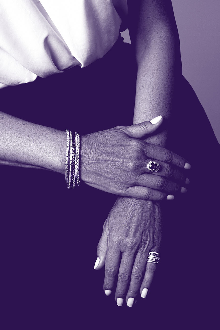
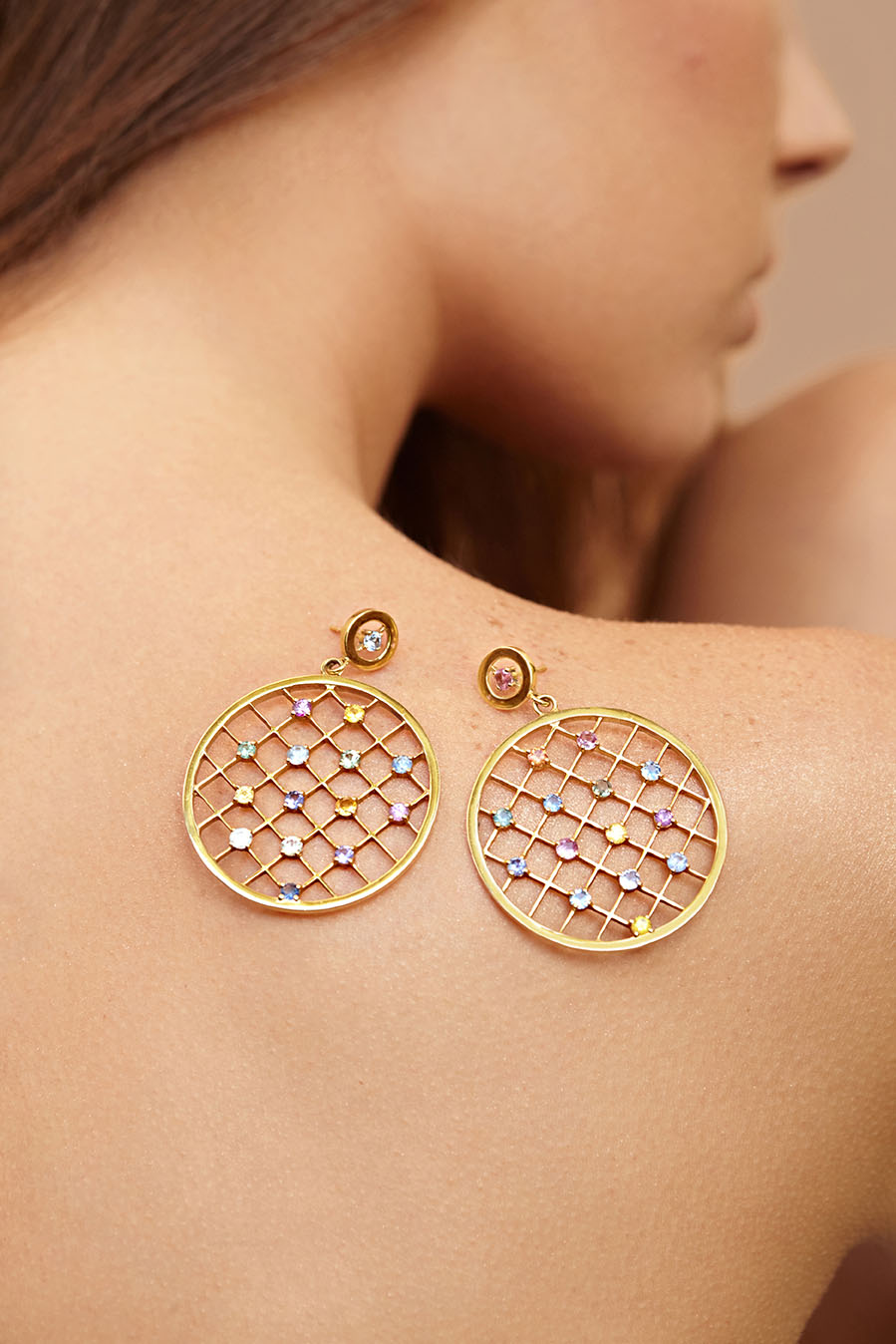
Maison Mirath’s story is one of refined craftsmanship with perfection hidden in the details, one that is timeless which imbues classical designs with a modern twist and one that captures the unique experiences, values, setbacks and triumphs inherent in all women.
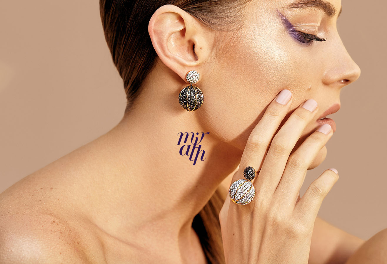
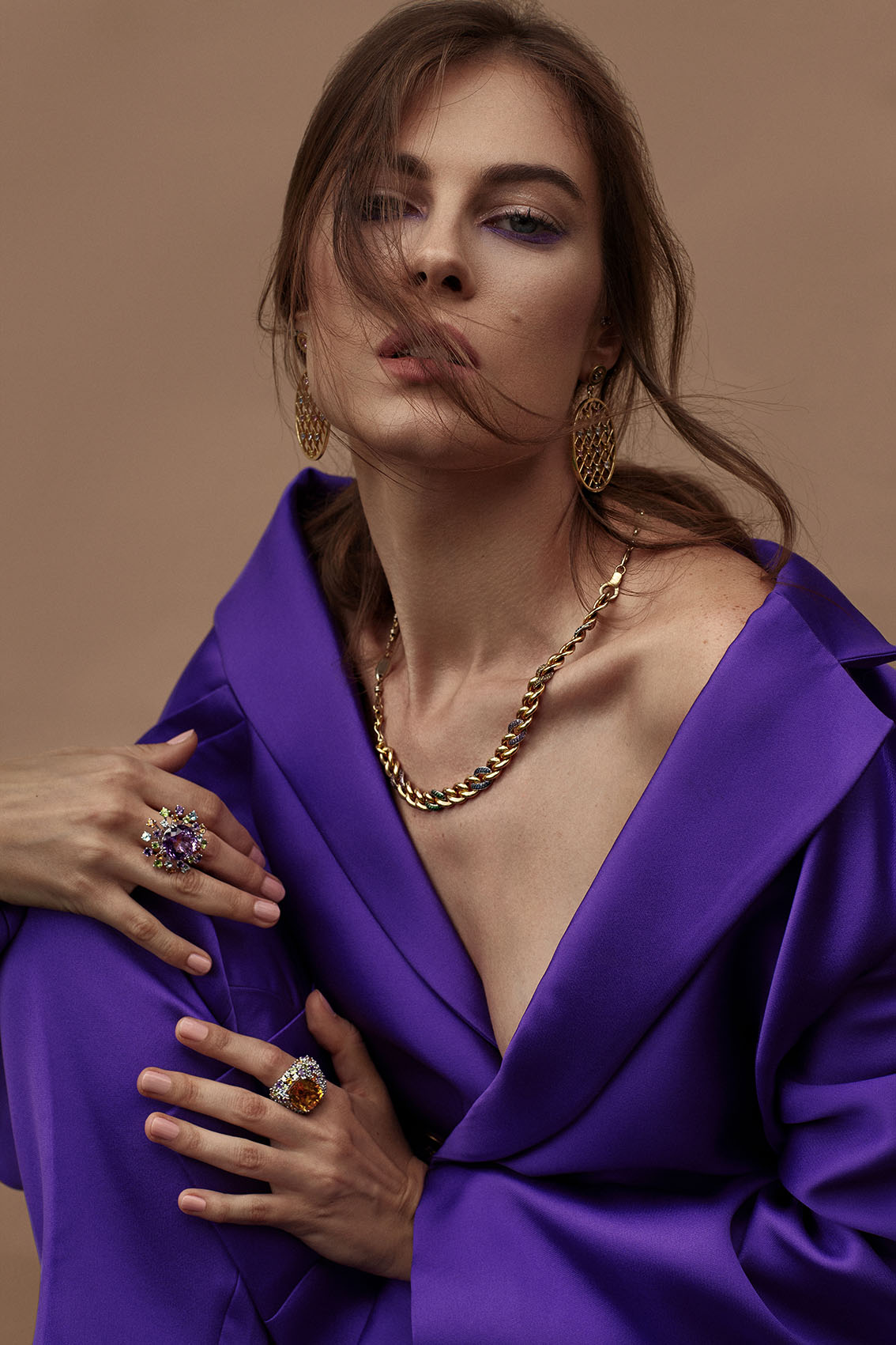
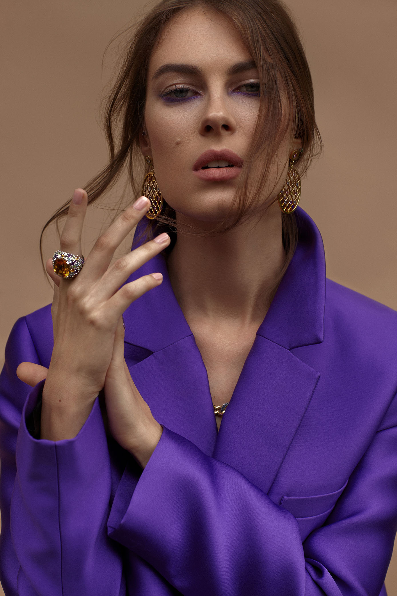
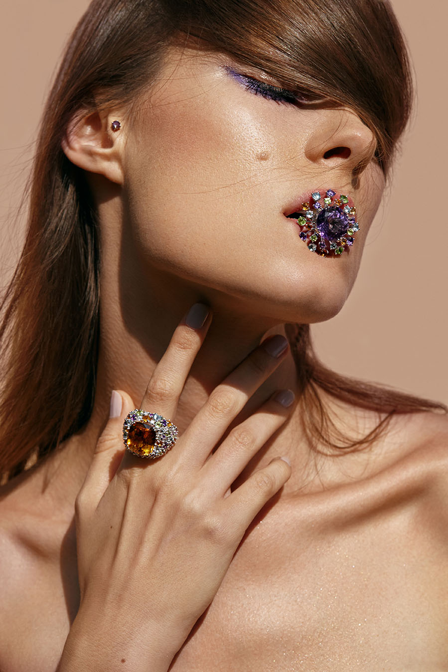
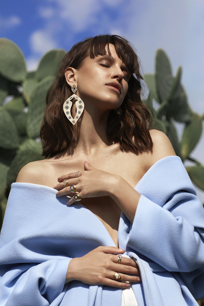
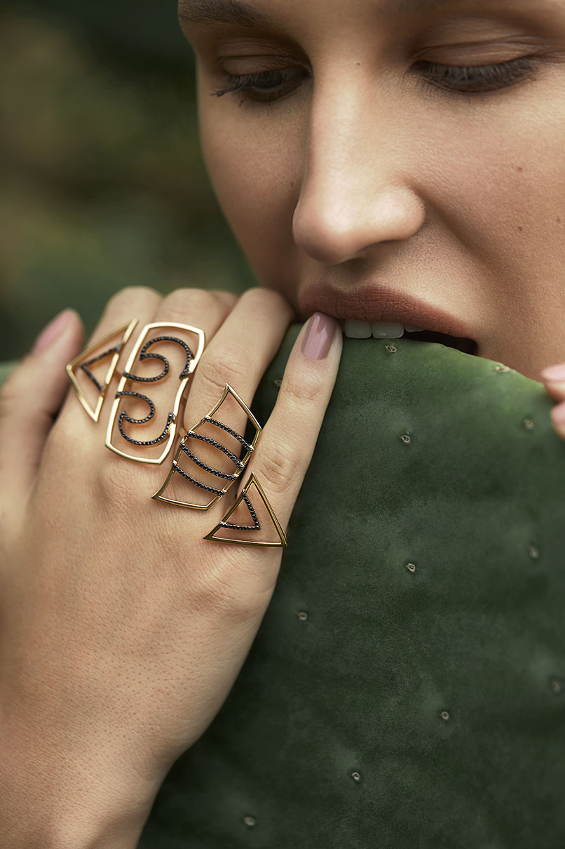
Unapologetic in her individuality, strong in her conviction, unique in her tastes and bold in her choices – the Mirath woman views her fine jewelry as an extension of herself.
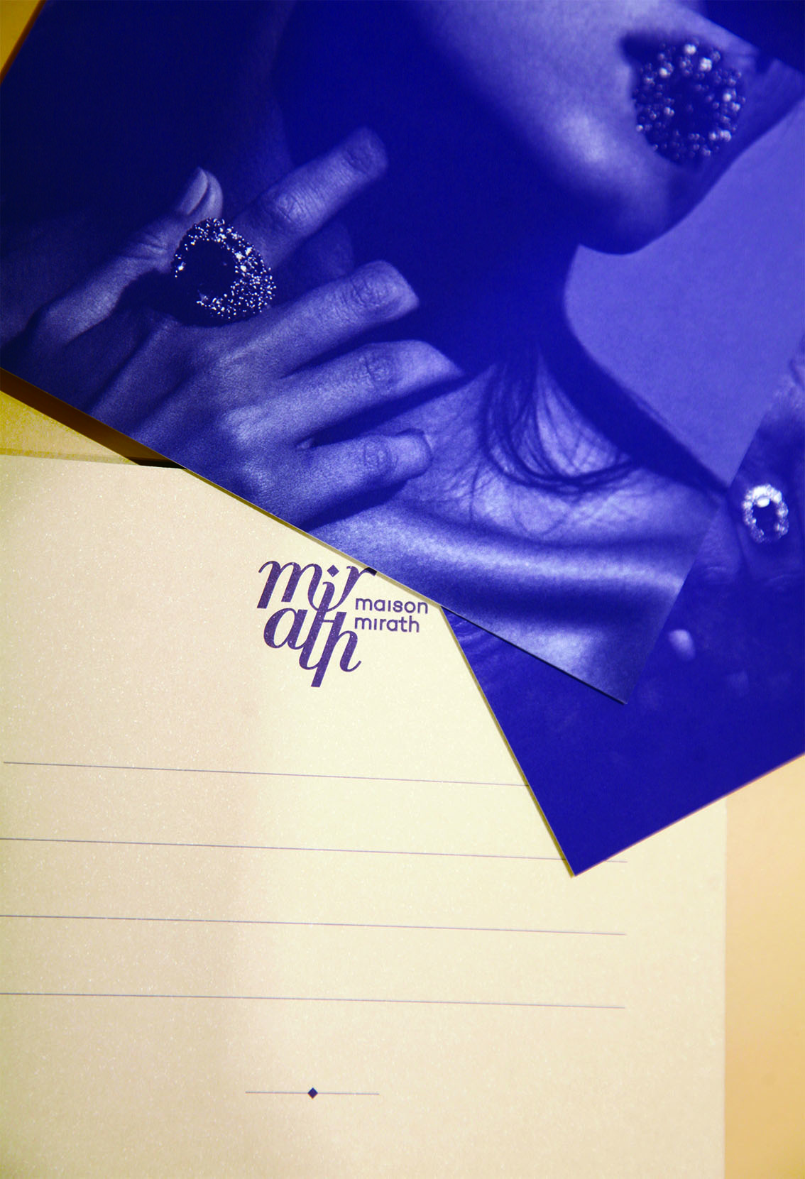
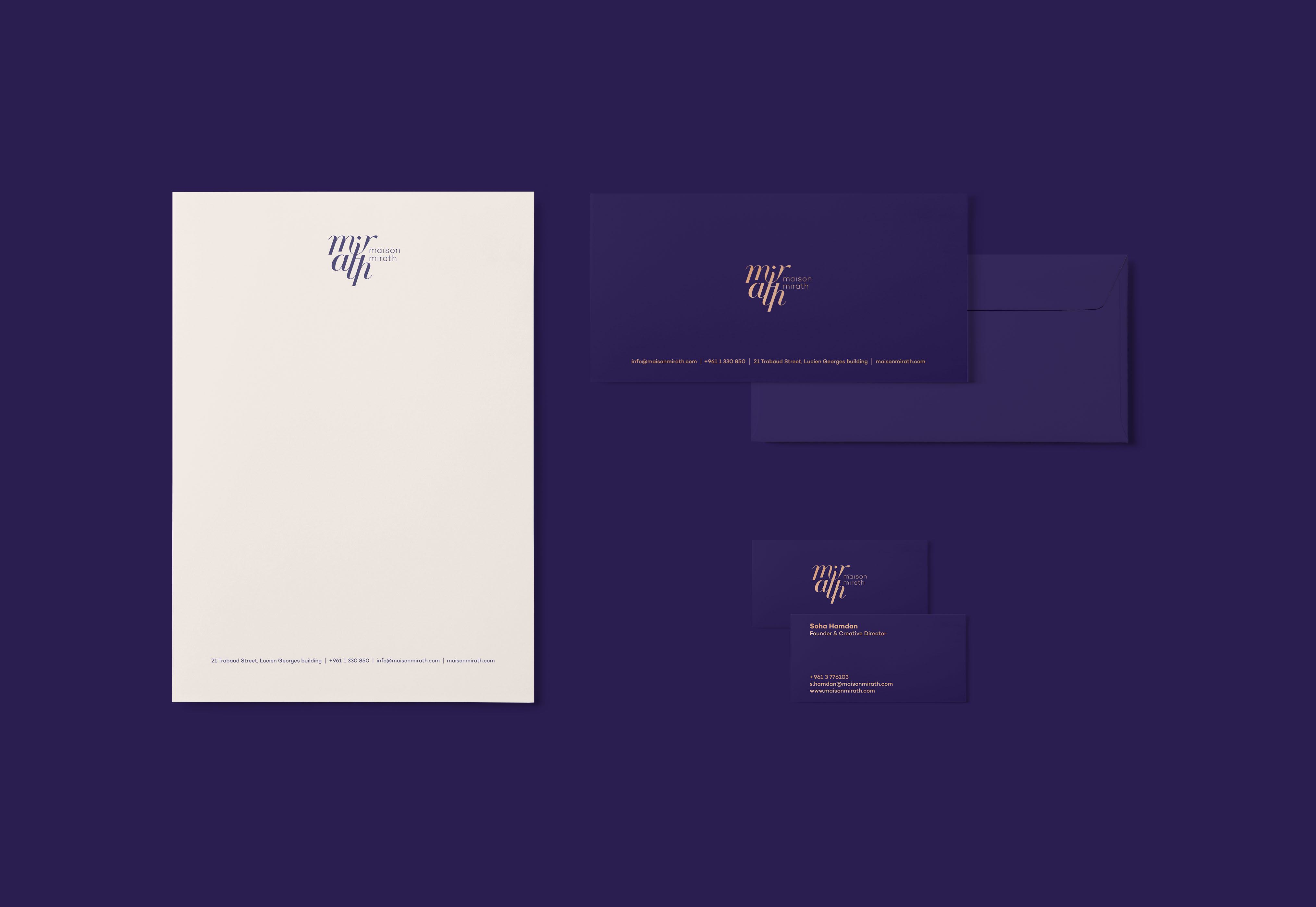
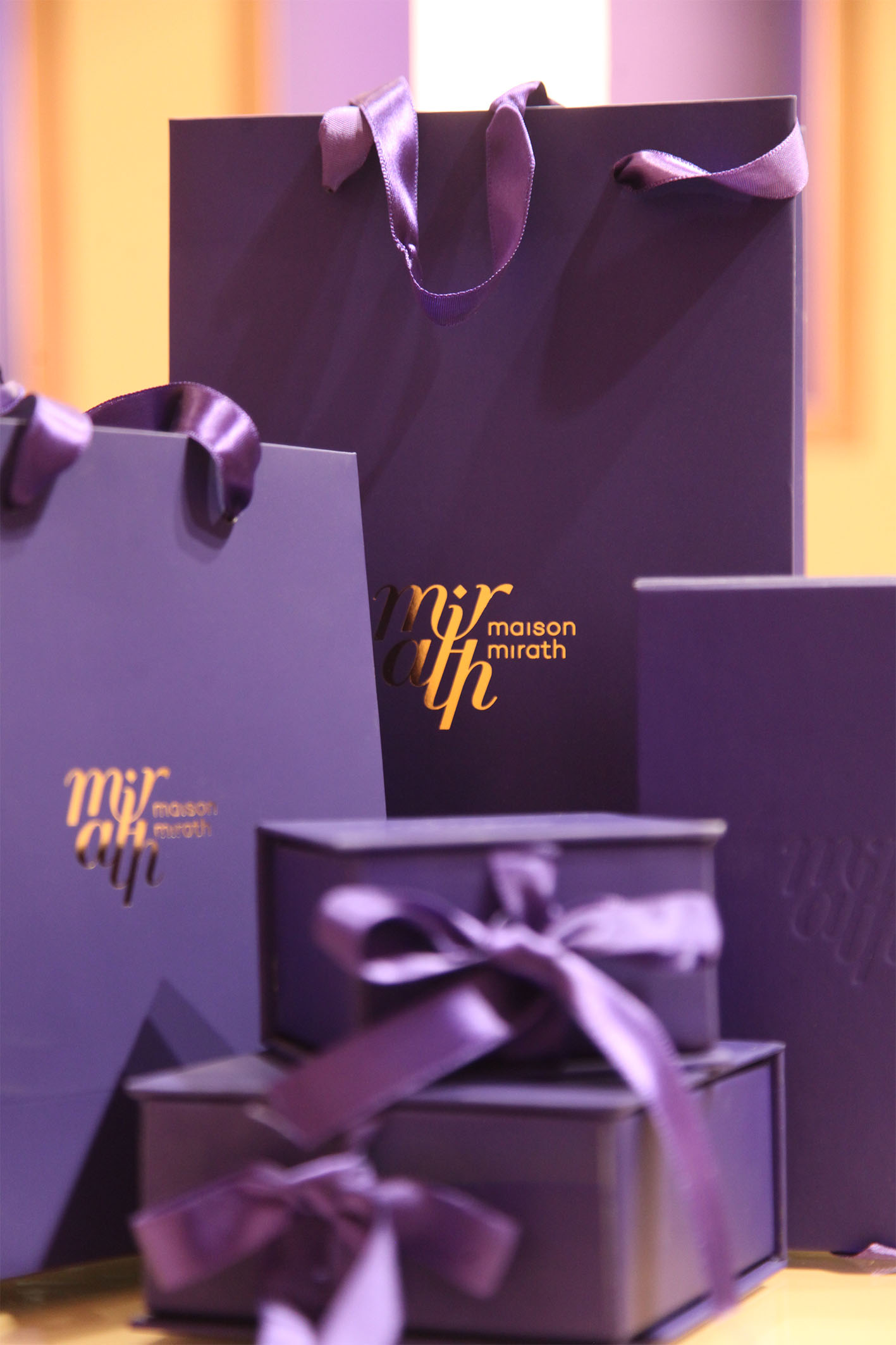
This branding exercise was complemented by a visual deconstruction of the classical emblem, where custom typography subtly interacts with the Arab dot, creating a harmonious interplay between identity and aesthetics. This minimalistic, high-end appeal remains wild at heart, and through the art direction of the editorial we see the strong Mirath woman at her natural rawness.
Fashion branding, especially at a luxury level, is distinguished by an often mundane, expected set of aesthetics, but our approach differed. The Maison Mirath brand is proof that one size does not fit all and in this case, beauty is in the details.